
I’ve installed and been fiddling around with OsmAnd~ for a few days now. And I have to say it is dense. It has way too many details and it feels overwhelming.
For all its faults, Google Maps works really well when it comes to showing information. More and more details are shown as you zoom in.
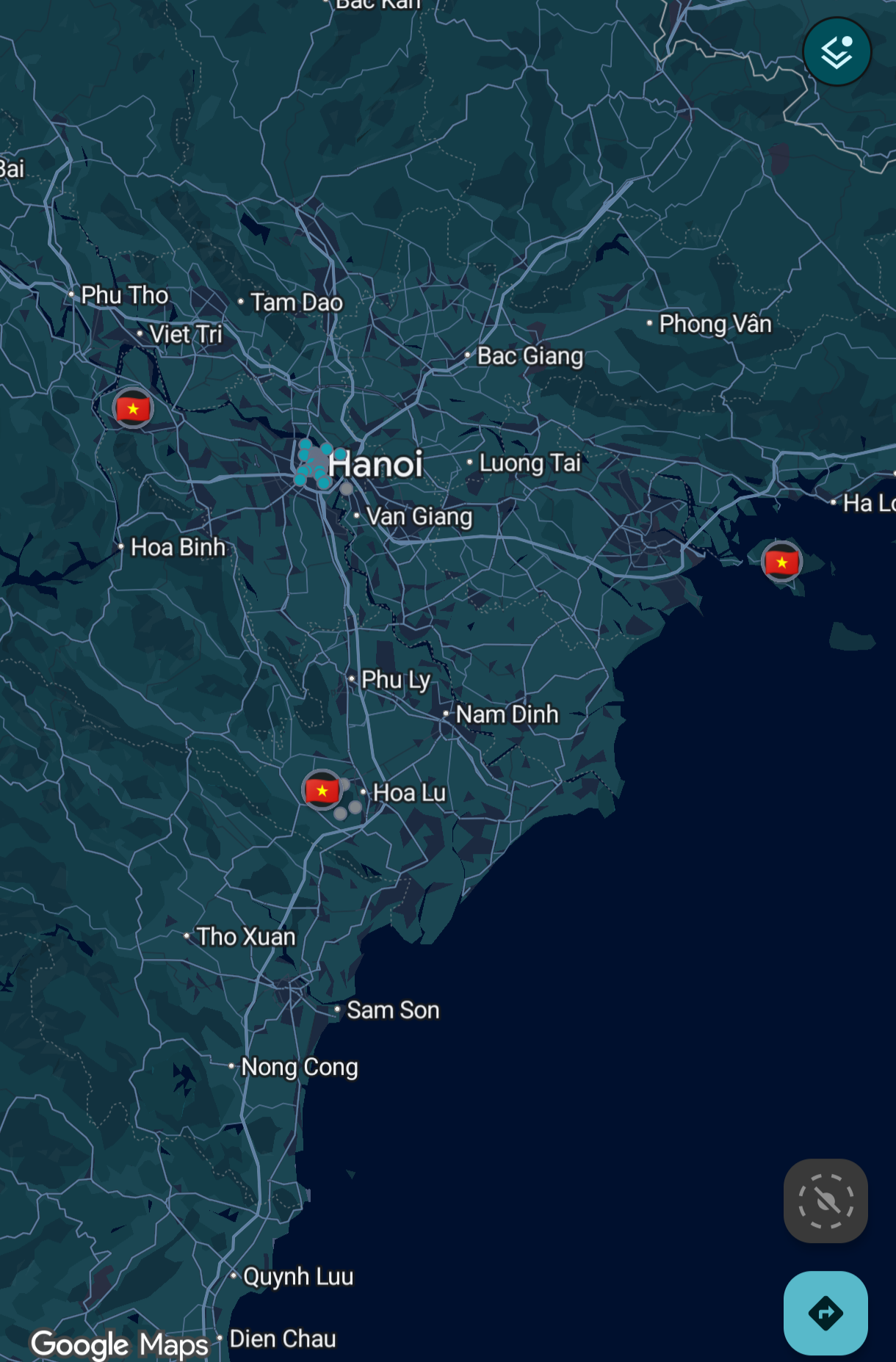
That’s not the case with OsmAnd.
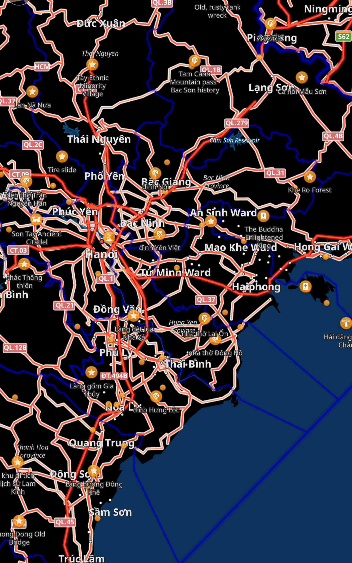
So much detail is on the screen when I’m looking to just get an idea of the region and I don’t even know where to start.
How can I make it look like Google Maps? Maybe I’ll be able to use that as a starting point and configure it further as needed?
Thanks.
OSMAnd is just for a different data-driven type of user. Has a lot of different options which can make the interface very cluttered and confusing, but also offers a ton of functionality that other maps don’t.
Having a lot of functionality doesn’t necessarily mean having a bad interface - check KDE for example.
I think they simply have way too many more developers than UI designers.
That’s my biggest complaint about most open source projects. They’re very clearly made only by a developers, and not one designer.
You have a good point about the UI. Compare the screenshots and Maps has a nicer UI that shows names of the major places, major and minor roads have different widths, and gives sense of overall geographical features (lakes, hilly areas etc.)
KDE is a great example of what I was talking about. It’s exactly why I don’t use it.
Wait, you mean you don’t use kde because it isn’t cluttered by default?
Because it is
Oh, kde is is cluttered by default? What desktop do you use then? I’m really curious
GNOME ofc.
You have a really good taste! I myself think kde’s settings app is a bit messy, really love gnome’s design