
I’ve installed and been fiddling around with OsmAnd~ for a few days now. And I have to say it is dense. It has way too many details and it feels overwhelming.
For all its faults, Google Maps works really well when it comes to showing information. More and more details are shown as you zoom in.
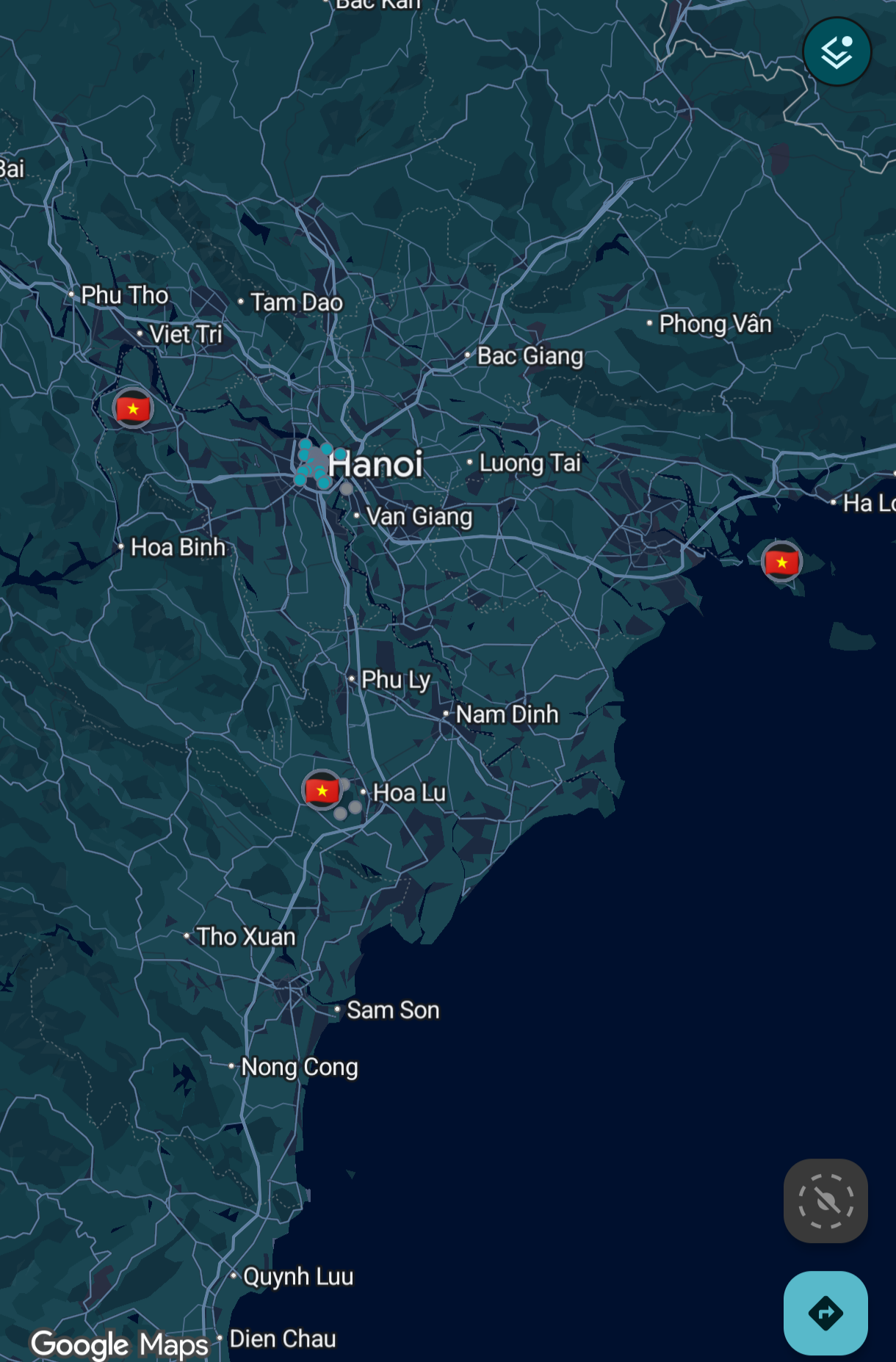
That’s not the case with OsmAnd.
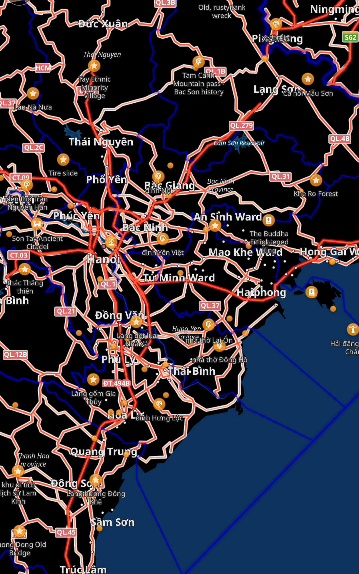
So much detail is on the screen when I’m looking to just get an idea of the region and I don’t even know where to start.
How can I make it look like Google Maps? Maybe I’ll be able to use that as a starting point and configure it further as needed?
Thanks.
Oh, I didn’t know that! I do still like CoMaps more though, since it’s open-source, community-run (it’s in the name!), and generally a more pleasing UI in my opinion (it genuinely looks really nice!)
And of course you have the benefit of not having loads of trackers on your maps app (which should be designed to track your location, not your ad preferences!)
I’m also super surprised how accurate the navigation is, even for pedestrian streets it had all the things you would want: automatic path switching when you make a wrong turn, voice outputs that auto disable when your headphones disconnect, and a really accurate time left estimate!