I really don’t care. But as far as i know. The landmass distortion on mercator is “corrected” by having boxes of “different sizes” across the map. Except that each box is actually respresenting the same km2
I don’t know what image on the article is about.
When looking into the eckert IV, this seems to be as accurate it gets
Which i think is quite good. It’s a good compromise between shape and landmass, by NOT projecting it on a rectangle.
Now compare this image, to the one in the article.
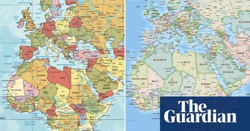
It looks so stupid how they’re trying to overlay them while removing the context from both.


I really don’t care. But as far as i know. The landmass distortion on mercator is “corrected” by having boxes of “different sizes” across the map. Except that each box is actually respresenting the same km2
I don’t know what image on the article is about.
When looking into the eckert IV, this seems to be as accurate it gets
Which i think is quite good. It’s a good compromise between shape and landmass, by NOT projecting it on a rectangle.
Now compare this image, to the one in the article.
It looks so stupid how they’re trying to overlay them while removing the context from both.