
Also, reminder that the places interface they were developing on the old site is awesome:
https://reg.bom.gov.au/places/
– you can navigate to an arrangement of weather info for a place and just bookmark that URL.
Also, reminder that the places interface they were developing on the old site is awesome:
https://reg.bom.gov.au/places/
– you can navigate to an arrangement of weather info for a place and just bookmark that URL.
Doesn’t surprise me, the old website is a much better user experience for me.
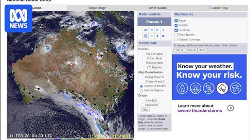
The new one is noticeably slower, hides the info I want to see behind extra clicks/scrolling, made the radar view worse, and doesn’t improve the only thing I’d want to improve from the old site (making it easier to find less commonly used information such as river heights or past observations). In fact they made that part worse because now it bounces between the new design and remnants of the old one for anything bar the most commonly visited sections - even for basic stuff like a synoptic chart.
That’s what gets me. It’s the very definition of bad UI design. You’re meant to reduce the number of steps for the user to achieve their goal or complete their task.