


This design looks so cheap to me, it’s just a bunch of random covers, there is no information about the movies presented in any way, the covers are way too big and take up an inordinate amount of space and there is nothing breaking up sections, design is just so fucking dumb now, fuck mobile
rant over 😅
The title would have to be pretty fucking long, but there are a few out there.
Here, I fixed the examples in a couple of ways.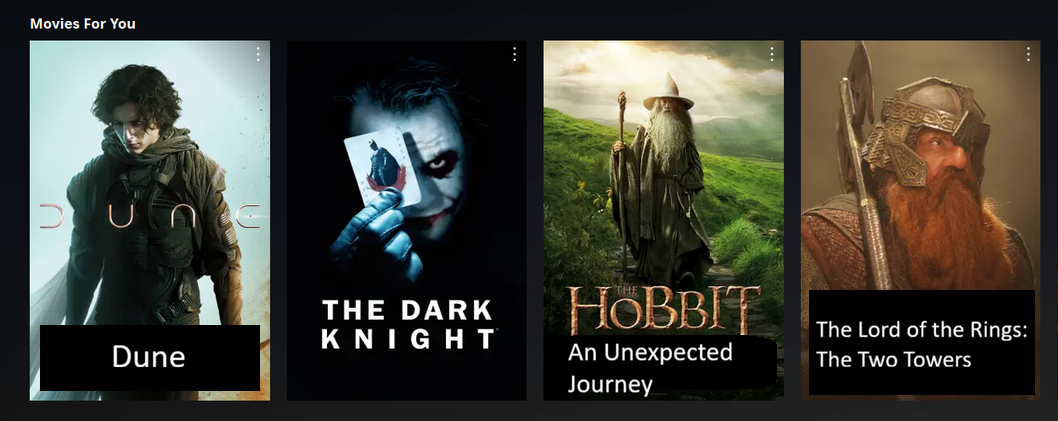
🤮
Why not just do away with posters at all then? Just have a black screen with white text lists. Perfect UI and UX……