
I’ve installed and been fiddling around with OsmAnd~ for a few days now. And I have to say it is dense. It has way too many details and it feels overwhelming.
For all its faults, Google Maps works really well when it comes to showing information. More and more details are shown as you zoom in.
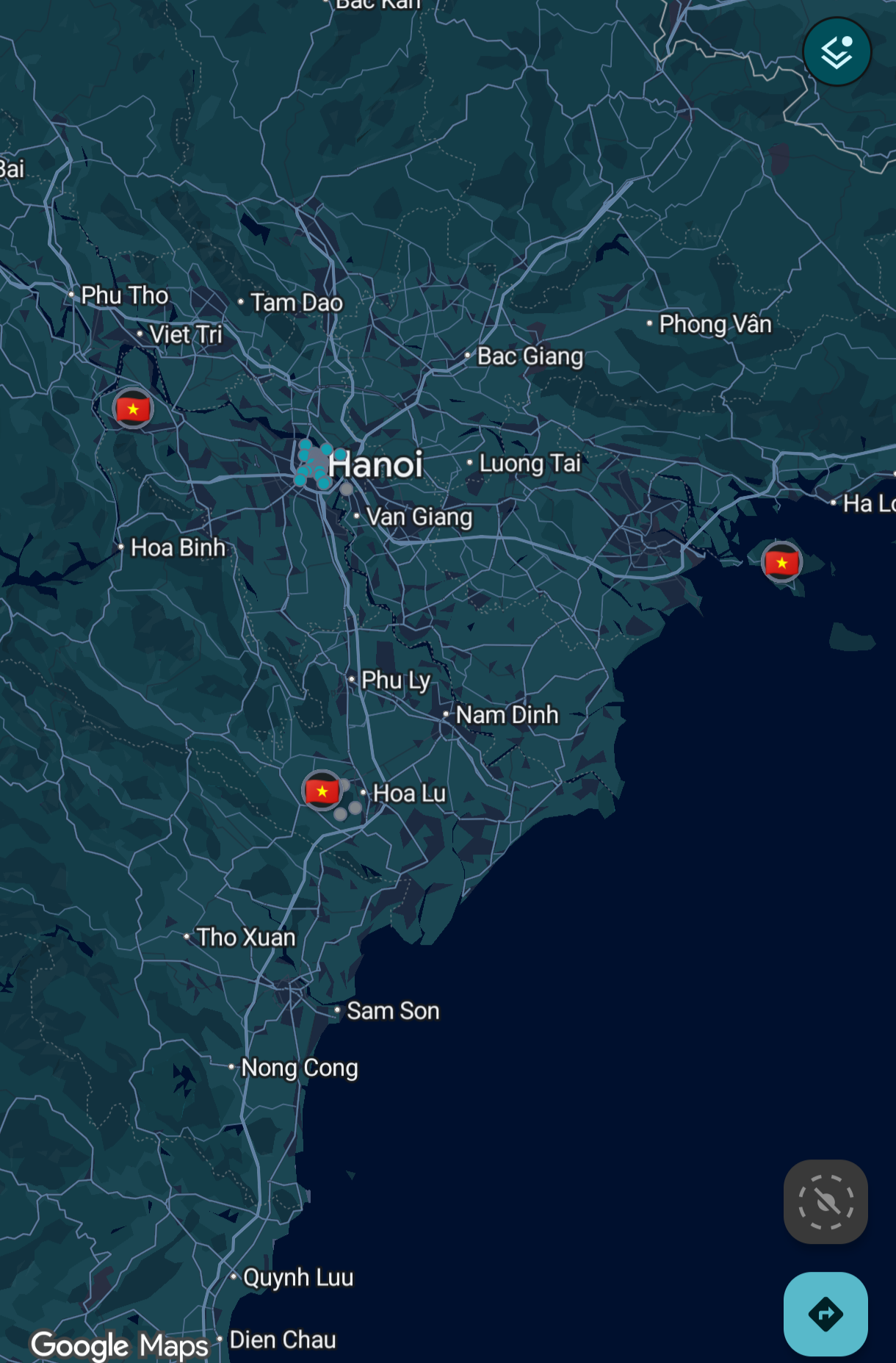
That’s not the case with OsmAnd.
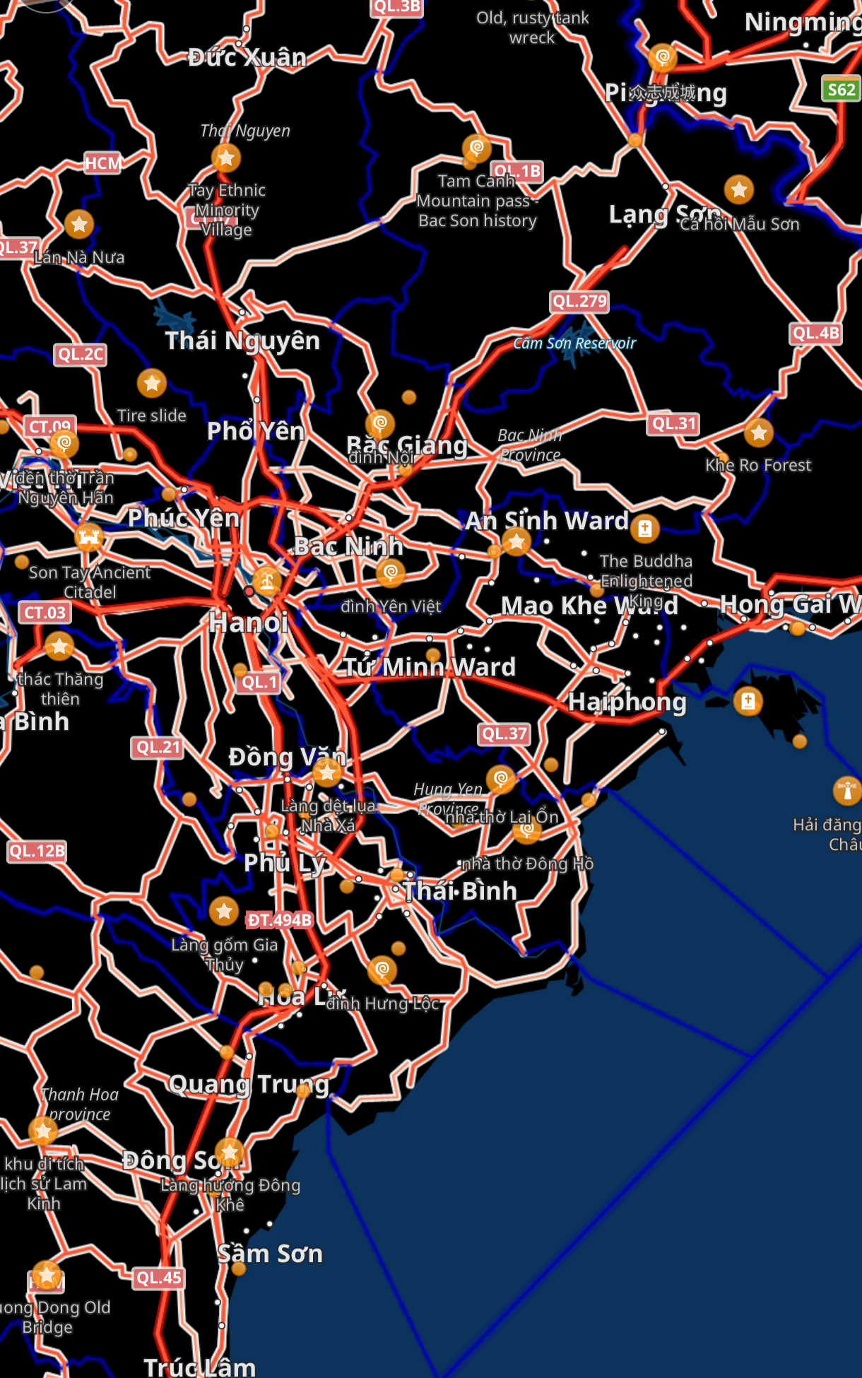
So much detail is on the screen when I’m looking to just get an idea of the region and I don’t even know where to start.
How can I make it look like Google Maps? Maybe I’ll be able to use that as a starting point and configure it further as needed?
Thanks.
Yeah, go with CoMaps. It has less features than OsMand, but in return you get a user friendly UX/UI.
My OSM doesn’t look like. OP’s. Mine looks a lot like CoMaps.
Though I’d agree CO is less dense. Not sure which I prefer.
I said it in another comment but it looks like that because I tried to make it look like Google Maps first, as a baseline.
I can’t seem to get it just right. It’s either too sparse or too dense.