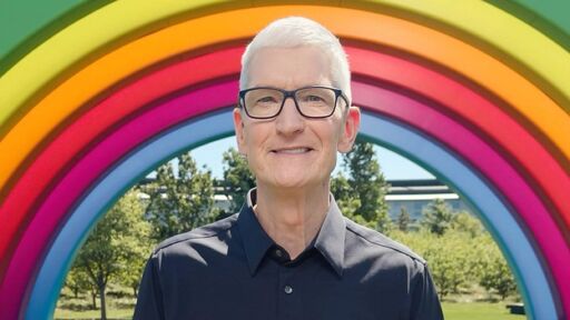
Apple CEO Tim Cook is stepping down as Apple's chief executive officer, and hardware engineering chief John Ternus is set to take over, Apple announced today. Cook will continue on as Apple CEO through the summer, with Ternus set to join Apple's Board of Directors and take over as CEO on September 1, 2026. Cook is going to transition to executive chairman, and he will "assist with certain aspects of the company, including engaging with policymakers around the world".
Literally not a single lick of usability improved from glass theme. Lots of elements worse. I support a handful of relatives and none of them like the change and still find the theme confusing.
I’ve only used it in passing when somebody’s handed me their phone to put my number in or something but I think the big objection is not what it looks like but it’s usability or lack thereof.
Why would I want my user interface to be transparent, isn’t the whole point that I need to be able to see the interface surely I want it to stand out from the background.
The other complaint is that the analogy doesn’t really work, glass isn’t a liquid substance, so why does it make sense for the sliding toggle to morph?
The transparent theme is just one of several settings for it, and that it idiotic, but the normal mode when it adds a bit of gloss and texture to the icons is great


I like it ):
It is way prettier than the standard flat icon theme.
I thought I was the only one. Genuinely my favourite theme they’ve used.
Literally not a single lick of usability improved from glass theme. Lots of elements worse. I support a handful of relatives and none of them like the change and still find the theme confusing.
That is a perfectly valid criticism of the glass theme, I just think it looks better than the old flat icon theme
I’ve only used it in passing when somebody’s handed me their phone to put my number in or something but I think the big objection is not what it looks like but it’s usability or lack thereof.
Why would I want my user interface to be transparent, isn’t the whole point that I need to be able to see the interface surely I want it to stand out from the background.
The other complaint is that the analogy doesn’t really work, glass isn’t a liquid substance, so why does it make sense for the sliding toggle to morph?
The transparent theme is just one of several settings for it, and that it idiotic, but the normal mode when it adds a bit of gloss and texture to the icons is great
Hilarious that you got downvoted into the negative for daring to voice a dissenting opinion. Truly, Lemmy is a child of Reddit.
Edit: Back above zero! I take it back, maybe I spoke too soon?
I’m upvoting just to counterbalance the people downvoting because they dislike someone else’s subjective opinion.
I do kind of wish that there was a way to bring back the old squishy gel 3D icons, though.
The current thing is a bit of an awkward cross between them, and the flat colours that seem to be basically everywhere now.
I miss the skeuomorphism of the really old versions. I loved that the game center looked like a poker table, for instance.
They are cheaper and easier to make, which sucks as it will take a long time for companies to spend the money/time ):