
It looks familiar to the windows one too, which I guess is good to win over windows users :)
Yes, but in a way the graphs themselves look not es gnomie I would like them to have. They could look closer to the graph that is being done for the Wellbeing feature in the gnome-control-center.
The graphs are gnomie for the normies (:
ok, you win. [=
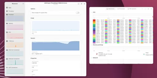
This is great news, because GNOME System Monitor itself is a resource hog which is annoying when you’re trying to find out what is hogging the resources on your system!
What is the logic behind the renaming? Is “Resources” more intuitive than “Gnome System Monitor”?
It’s not a rename. Resources if a different app that already exists and will be taking the place of the existing system monitor.
They should replace their brains with ones that work.

