sirdorius@programming.dev to linuxmemes@lemmy.world · 14 hours agoDual booting into Windowsprogramming.devimagemessage-square46fedilinkarrow-up1409arrow-down13
arrow-up1406arrow-down1imageDual booting into Windowsprogramming.devsirdorius@programming.dev to linuxmemes@lemmy.world · 14 hours agomessage-square46fedilink
minus-squaresirdorius@programming.devOPlinkfedilinkarrow-up111arrow-down1·edit-214 hours agoI wanted to use the current Windows logo, but it’s so incredibly stupid, you wouldn’t even recognize it. This is what happens when a $100 bn profit/year company is too cheap to hire artists:
minus-squaremagnue@lemmy.worldlinkfedilinkarrow-up26·10 hours agoTIL windows 1 logo was the best logo
minus-squareBladeFederation@piefed.sociallinkfedilinkEnglisharrow-up1·36 minutes agoThere’s also this gem that was used infrequently around 3.0 era. I call it Windows Noir.
minus-squareThunderbird4@lemmy.worldlinkfedilinkarrow-up6·7 hours agoIt does kinda look like a cafeteria tray, though.
minus-squaresomenonewho@feddit.orglinkfedilinkarrow-up10·8 hours agoSrsly wtf I saw that and immediately thought “Well that would be a great modern logo” its flat and sleek but still recognizable enough. Guess the marketing department didn’t want to admit “we got it right the first time”
minus-squaremagnue@lemmy.worldlinkfedilinkarrow-up3·5 hours agoEven seems to suggest use of a tiling window manager that MS still hasn’t properly implemented.
minus-squareprole@lemmy.blahaj.zonelinkfedilinkarrow-up4·edit-28 hours agoYeah that logo is better than the modern logos by far
minus-squareinari@piefed.ziplinkfedilinkEnglisharrow-up78·12 hours agoIt’s just the blue screen of death now. Apt.
minus-squareAuster@thebrainbin.orglinkfedilinkarrow-up22·12 hours agoI think it’s a projection joke. Win12 isn’t even released yet.
minus-square87Six@lemmy.ziplinkfedilinkarrow-up1·9 minutes ago12? Even 11 isn’t out yet. Or at least I haven’t heard.
minus-squareBlue_Morpho@lemmy.worldlinkfedilinkarrow-up5·9 hours agoYou think they didn’t pay marketing consultants millions for that logo?

I wanted to use the current Windows logo, but it’s so incredibly stupid, you wouldn’t even recognize it.
This is what happens when a $100 bn profit/year company is too cheap to hire artists:
TIL windows 1 logo was the best logo
There’s also this gem that was used infrequently around 3.0 era. I call it Windows Noir.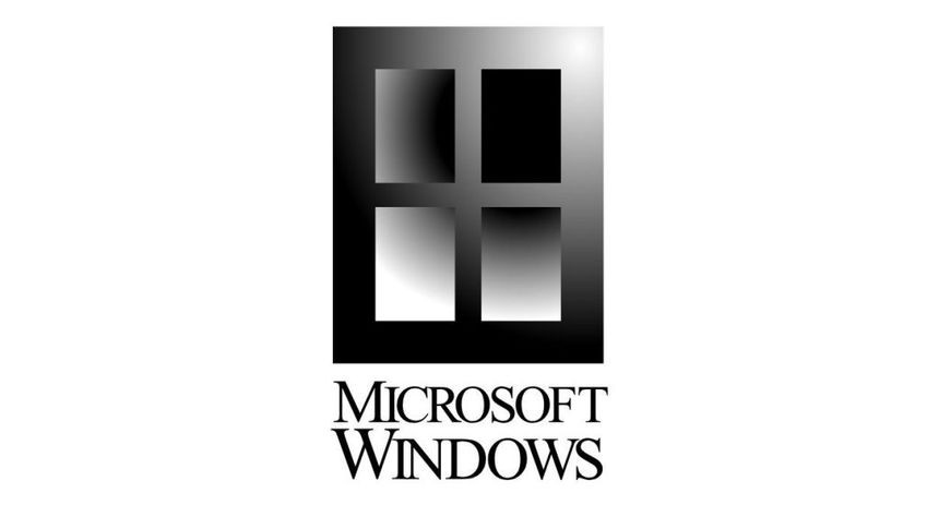
It does kinda look like a cafeteria tray, though.
Srsly wtf I saw that and immediately thought “Well that would be a great modern logo” its flat and sleek but still recognizable enough. Guess the marketing department didn’t want to admit “we got it right the first time”
Even seems to suggest use of a tiling window manager that MS still hasn’t properly implemented.
Yeah that logo is better than the modern logos by far
It’s just the blue screen of death now. Apt.
I think it’s a projection joke. Win12 isn’t even released yet.
12? Even 11 isn’t out yet. Or at least I haven’t heard.
You think they didn’t pay marketing consultants millions for that logo?
Window
s12